Rachel T. Nicoll
A focused selection of design projects.
Not only am I an innovative program/project manager, but I like to put my art background to work too.
And I bake scones.
And I bake scones.
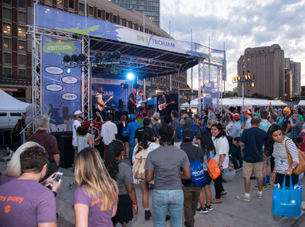
TechJam 2017
The entire look of the event was driven by the design for the staff t-shirt. An outside artist designed the t-shirt and I was responsible for all event artwork and signage using elements from that design.

Vendors are grouped into named 'villages' and located under larger tents. All of these 'villages' have a vinyl banner and 2 totems that light up at night.
3

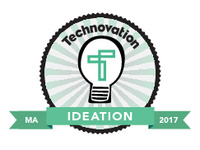
Technovation Badges 2017
These 5 badges represent milestones in the Technovation curriculum. The purpose of
badging is to encourage the girls to participate again, even if they don't finish their projects this year, by recognizing what they did achieve. There
will be a 6th and final (surprise!) badge for teams that do complete their
projects and make it to the Showcase (tbd). All teams get a digital badge for their team website, as well as stickers for all team members.
See the badge submission page here: http://masstlcef.org/technovation-2017-badges/
See the badge submission page here: http://masstlcef.org/technovation-2017-badges/
TechJam 2016
The branding for Boston TechJam was established at its inaugural event in 2013.
Since then I've been in charge of creating any new signage necessary and keeping it "on brand".
For 2016 I suggested going a slightly different direction. TechJam had been at Government Plaza since 2014 and this was the first TechJam since the new refurbished subway stop had reopened. In reference (and deference) to the classic subway signs that had been discovered during the initial demo, the signage for the main stage and the 5 'villages', ie tents/areas with vendors, used the established branding style but also mimicked this subway tile sign look.
All final artwork is vector-based so that it can be printed to any size.
Village banners were 17' wide, glowing totems are 8' tall.
Stage dimensions as indicated in diagram.
Additionally the event switched from using the standard preprinted badges and lanyards to fun stickers as name badges. I designed all of the stickers.

Another new thing for TechJam 2016 was the use of stickers as badges. This made it easier on registration staff - no need to print badges on the fly or prepare them ahead of time - and it was 1/3 the cost. Attendees had fun picking which design to use and customizing them. The six sticker designs were based on TechJam themes.Sticker Design Details:1:Hands guy from TechJam branding, 2:everyone's a star, 3:an important element4:Waterloo Clyde is a regular attendee, 5:robots are awesome!, 6:another TechJam branding element
9

Ed Foundation Branding
This character set and tagline was used for the MassTLC Education Foundation website in 2014 and 2015.


